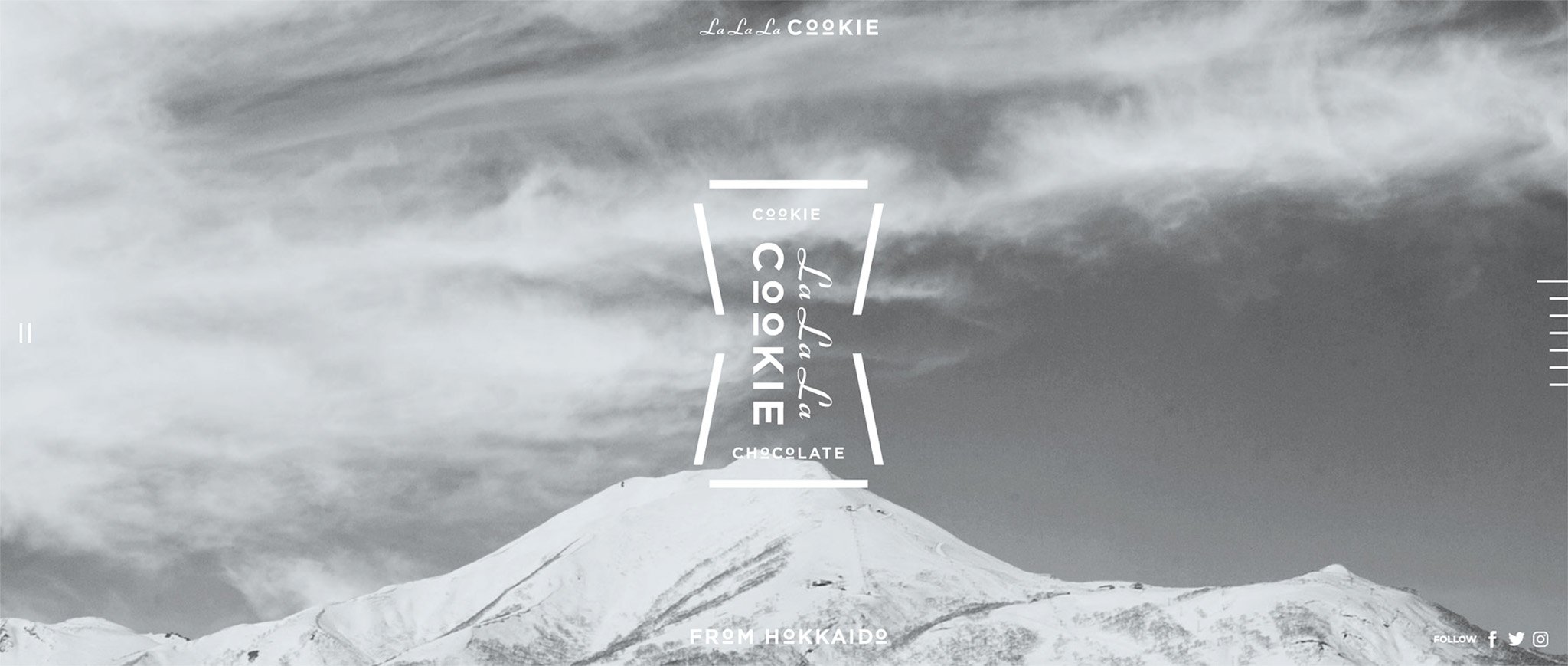
La La La Cookie
During my period as a Intern at COMMUNE (Sapporo, Hokkaido, Japan), I worked and contributed to the development of the project commissioned by Kinotoya (a renowned local confectioner), that consisted in conceiving from the ground up a new sweet unlike any other.
Beyond creating the packaging and the brand, the project was about designing the cookie itself (considering the ingredients and the shape), its stoyrytelling and the relative website.

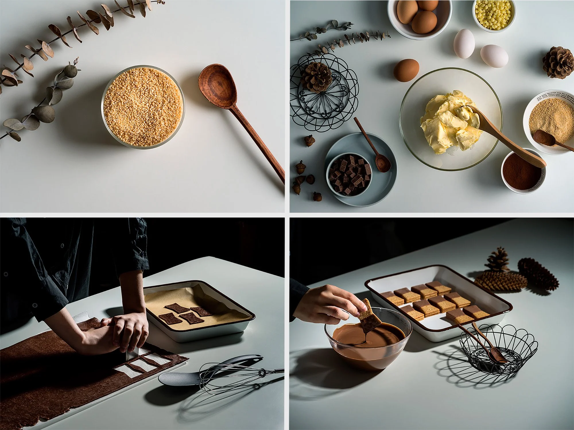
The particular designed cookie shape represents the craftsmanship knowledge proper of Kinotoya's: each one of the three layers of the biscuit, with their own delicate bow shape, can not be assembled by a machine.


The core design of the packaging has pop feeling and bold typography: the mountain horizon and the light blue of Hokkaido's soaring skies come together, just as the two halves of the cookie come together.
The size of the packaging was taken into careful consideration: each box contains just five cookies, reflecting the premium status of the product, while also maintaining a convenient size to travel with. Dedicated shopping bags aid in convenience, while highlighting the biscuit itself.


In accordance with the Japanese deeply instilled culture of gift/giving, the idea is to allow who take the LaLaLa COOKIE home to share the wonder of Hokkaido and it's prestigious ingredients: beyond the locally sourced butter, "Kitanohami" flour, beet sugar, and chocolate made with Hokkaido cream.
In addition to developing the visual identity and the brand concept, the creation of the product website was taken care of, paying particular attention to the stoyrytelling of the product.